TIMELINE
09.2024 - 12.2025
ROLE
UI/UX Designer
TOOLS
Figma
TEAM
Project Lead: Christine Cho
SWE: Amber Chow, Ananya Rath
Designers: Jasmin Duong, Andrea Lee
Brain Games Center - BGC
OVERVIEW
Simplifying the design and management of psychological research studies
MY ROLE - PRODUCT DESIGNER
Building a web application that has a comprehensive system to streamline psychological research studies at Northeastern University’s Brain Games Center, this project challenged me to create an intuitive tool for managing complex, nested components that power research experiments.
What is BGC?-
We are building an app that can easily build digital research studies with these cognitive games that are used to measure and assess individuals’ cognitive abilities. The client wants these games to be customizable as well, meaning certain values of these games can be edited. The application generates an output of these configuration files as a server code that can be input into Unity to run the research study.

The Problem-
Designing a system capable of organizing complex, nested components of psychological research studies.
Inside a study contains a lot of nested components such as variants, sessions, and tasks. We had to design in a way that..
makes it easy for researchers to manage and for users to interact with intuitively.
allowed the system handle multiple layers of variability and ensure smooth navigation for all involved parties.
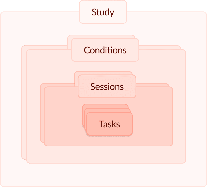
Data Hierarchy/Nested Components
Existing References-

allows clients to build studies through a portal

allows clients to customize tasks
we needed to consolidate these processes
we needed to update the UI to make a more polished, clean look
The Solution-
01 | Conditions Page and Side Panels:

New section of the information hierarchy, new pages for new features
02 | Task Template Edit and Preview
Finalized task customization screen, incorporated to preview page.

03 | Overall Flow

More screens to the product, update in flow
Lofis and Wireframes-
01 | Conditions Page
1st Pass - Variant Information Cards

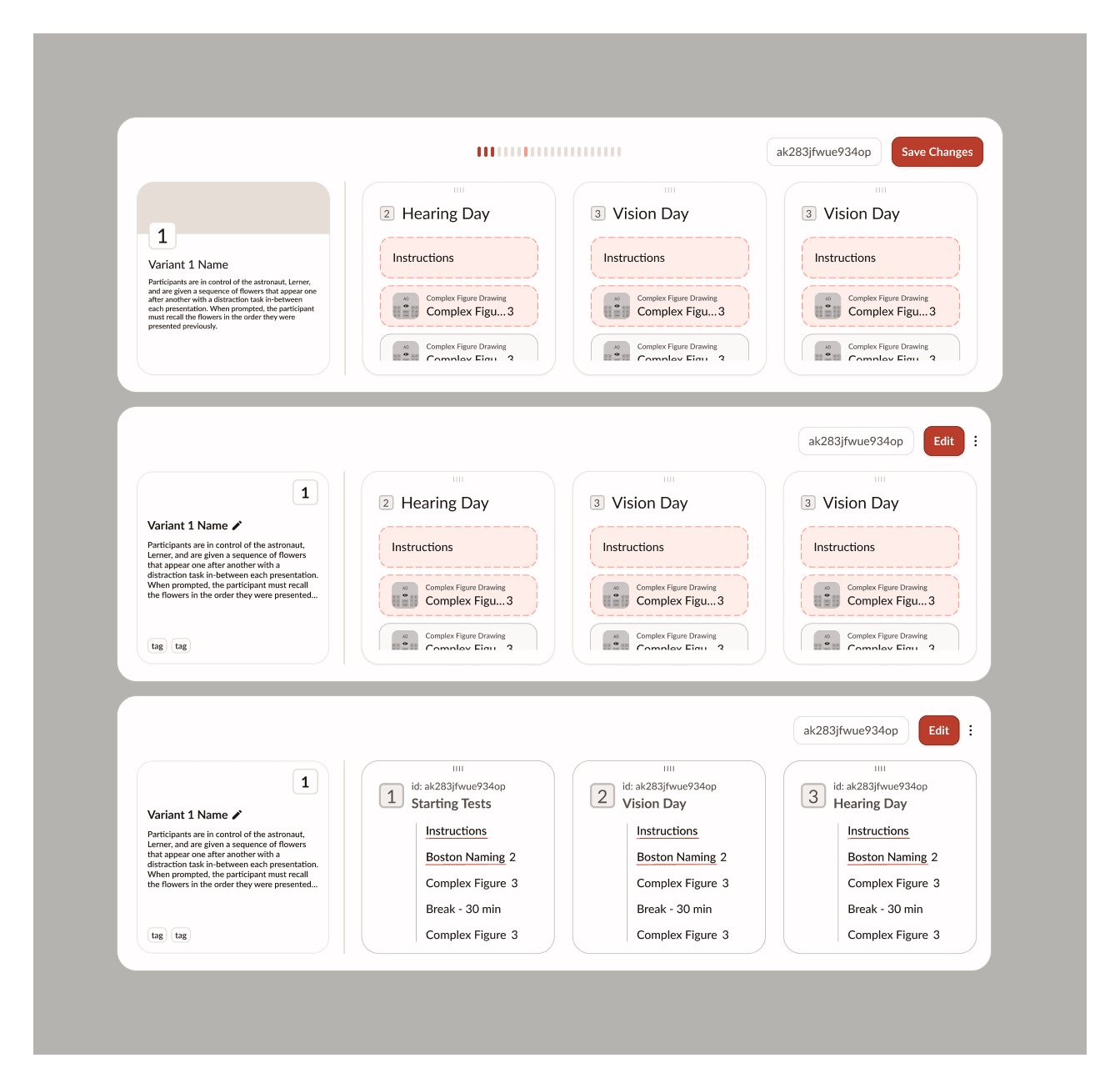
Taking inspiration from Notion cards, I wanted to attach every variant block with its own information card, where users can see/edit the name, read a short description, and view tags.
We decided not to continue with this idea due because it took up more space compared to how many session cards we wanted to show
2nd Pass - File Management Layout


Inspo from Finder
Taking inspiration from File management in Finder, I thought if the clients just wanted to access the variants easily, this would be one of the simplest layouts.
We decided not to continue with this idea because we wanted more information to be displayed and it was not appealing to the eye.
3rd Pass - Session Cards and Variant Sidebar
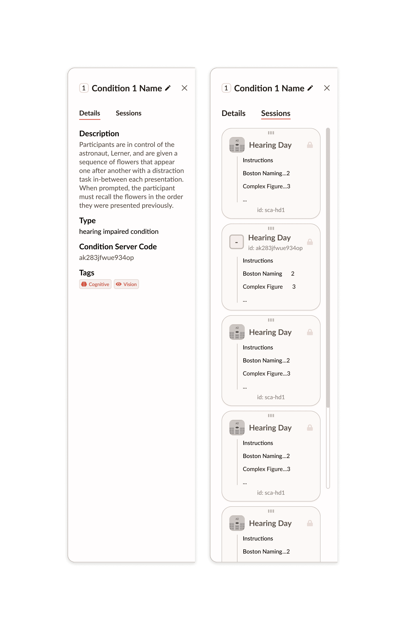

Final Screen
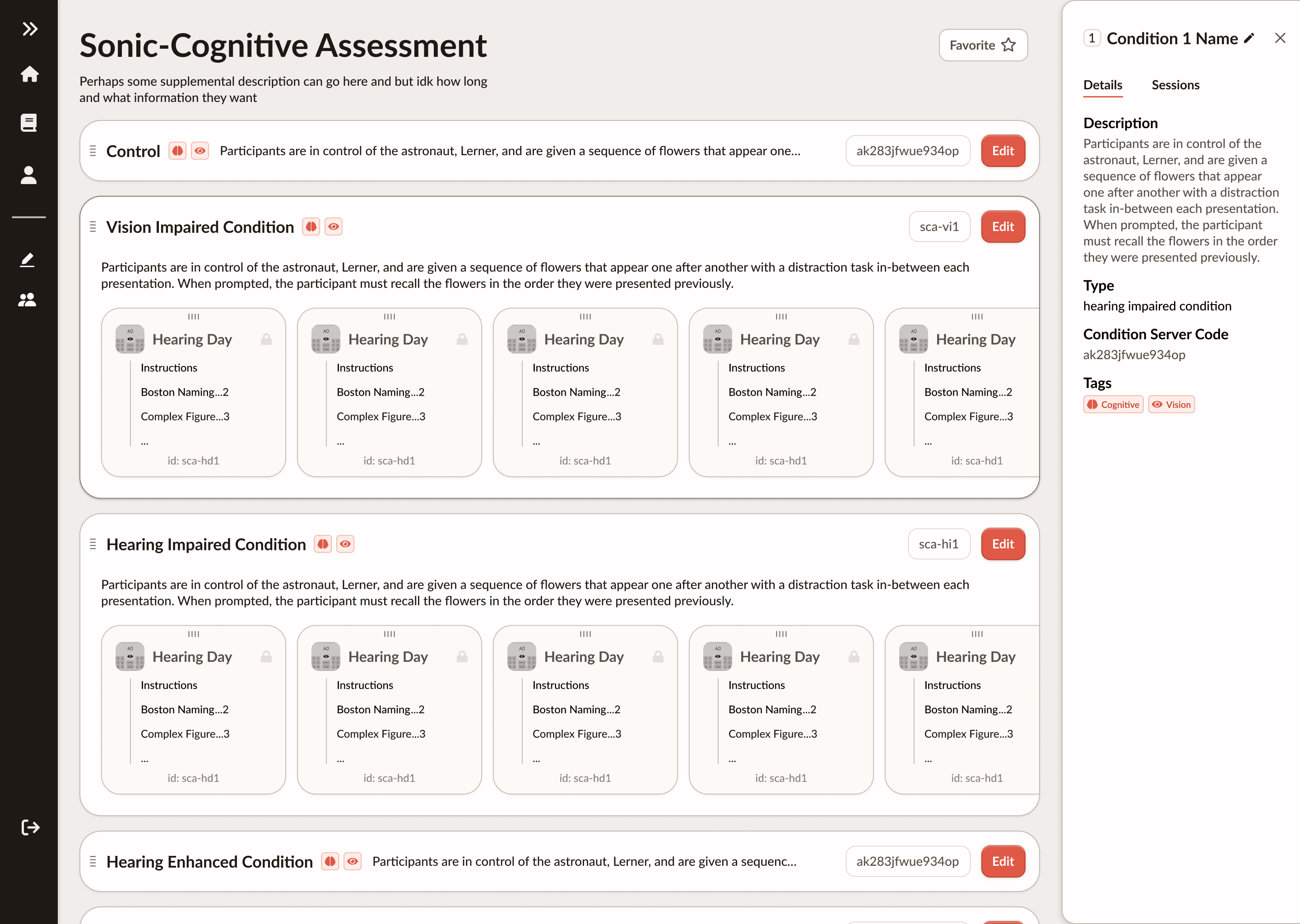
The conditions screen is made up of components such as Session Cards (left) that lists informational details about a session inside a variant of a study. The screen also contains a Condition info sidebar that pops up when a variant block is clicked. The user can switch between the details tab and sessions tab to view different types of the variant information
Prototype-
This project is still a work in progress, this is a screen that I wanted to showcase as a benchmark for my progress so far
Challenges & Takeaways-
Successes
The new system will significantly reduce the time researchers spend setting up studies
User feedback was positive, researchers reported that the interface was much more intuitive
Constraints
Understanding the scope of our project with its complex structure and nested elements
Gathering user feedback and trying to explain the project to others in a simple, concise way
This project taught me the importance of iterative design and user feedback. My initial approach was too complex, and it took several rounds of testing and refinement to reach a simple, yet effective solution. Huge thanks to Seitz and his team for their continuous feedback, which helped shape the final product.