


TIMELINE
06.2026 - 08.2026
ROLE
UX Engineer
TOOLS
Figma, Claude Design/Code
Arcault
OVERVIEW
calm intelligence for every household.
MY ROLE - UX Engineer
Arcault is a personal finance app built around actionable, personalized insights that help users make informed financial decisions. As UX Engineer, I researched, redesigned, and developed the product end to end, built a scalable design system for future engineers, and helped lay the foundation for the founder’s startup journey.


Main Insight from Research
People value dashboards for visualizing their financial data, but dashboards alone don’t motivate users to take action, limiting long-term engagement.
Main Thesis
How might we get people to trust, and engage with, an AI-first app for their money?

140
raw individual insights
Concept Remodel
Insights from research led me to create a 6-page memo on what we are designing and who we're designing for

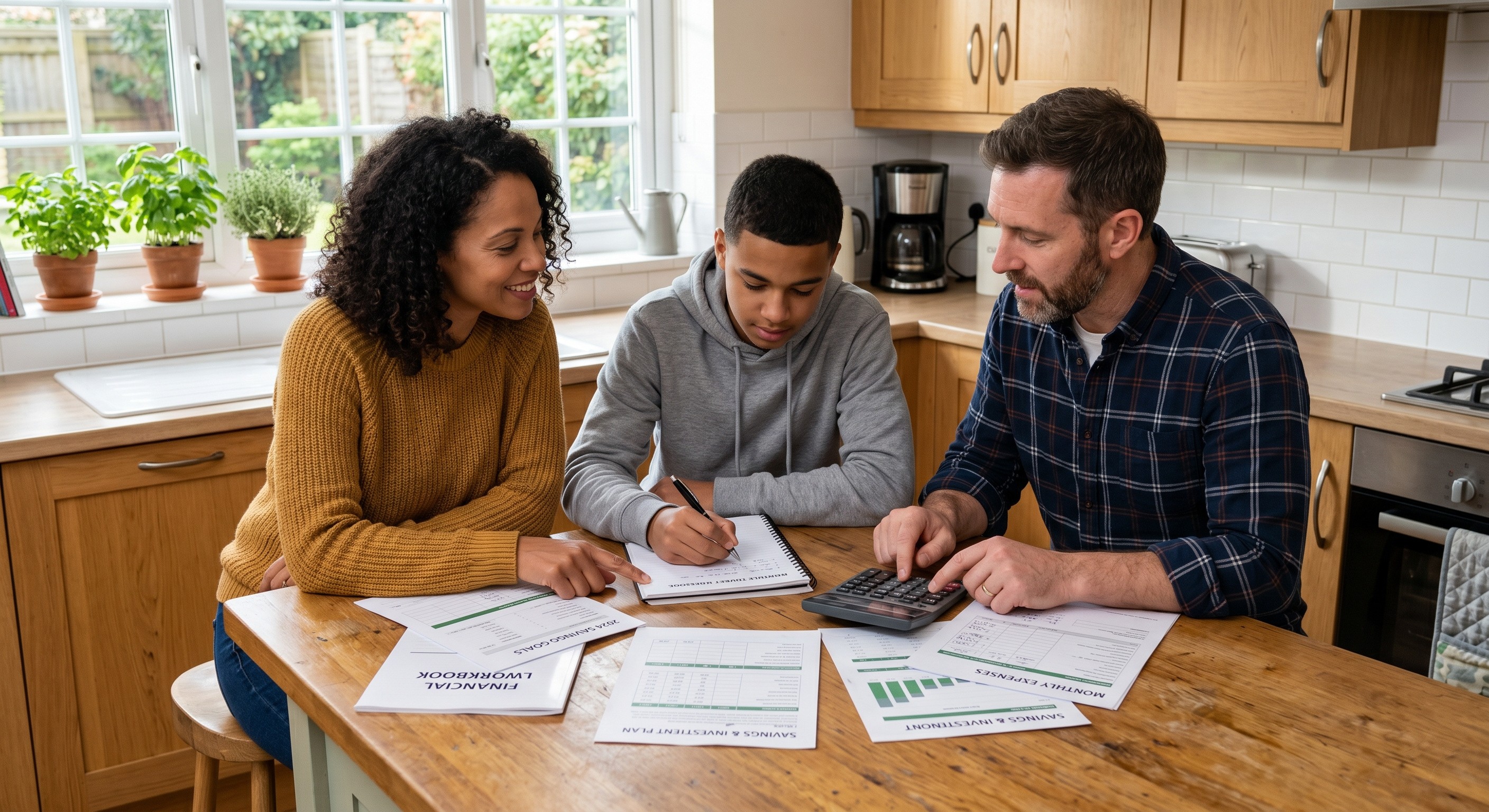
Target Audience
Everyday households
Niche
AI-powered, action-oriented household finance.
Concept Proposal
An AI-powered financial copilot that builds trust through personalized context, proactive guidance, and clear next steps, helping people understand and act on their money with confidence.
Final Deliverables
I created a:
Design System
+
Web App
Flows and Wireframes
I started on whiteboards and lo-fis. I made a user journey map of our ideal flow.

The user journey: 9 stages, from sign-up to recurring behavior.
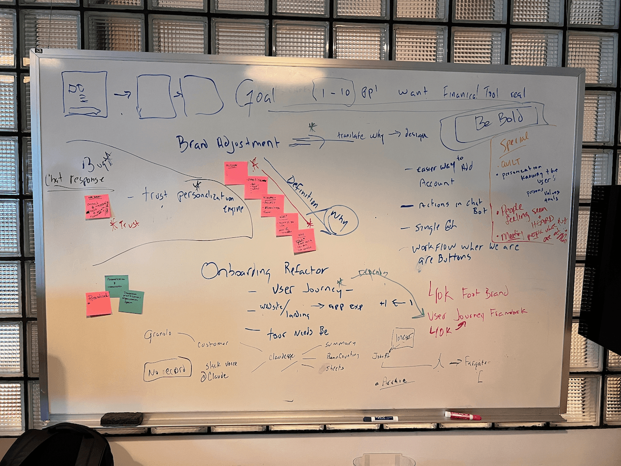
Day-one whiteboard with the founder.

Six dashboard directions in Figma.
Data-vis explorations

Financial data and a dozen ways to show them.
Design System
The old Storybook design library was cold and clinical, not great when you’re asking people to link their bank. I rebuilt it around “calm intelligence”, warm tones, minimal accents, and plain words. All shipped as tokens engineers can easily access through Claude.


The Landing Page
I designed and built a landing page with Claude Design + Code.
Lead with the gap
"Everyone gets data. Everybody deserves advice."
Trust up front
Read-only, never sells your data. Said before anyone asks.
One clear ask
“Get started” everywhere, nothing competing with it.
Onboarding
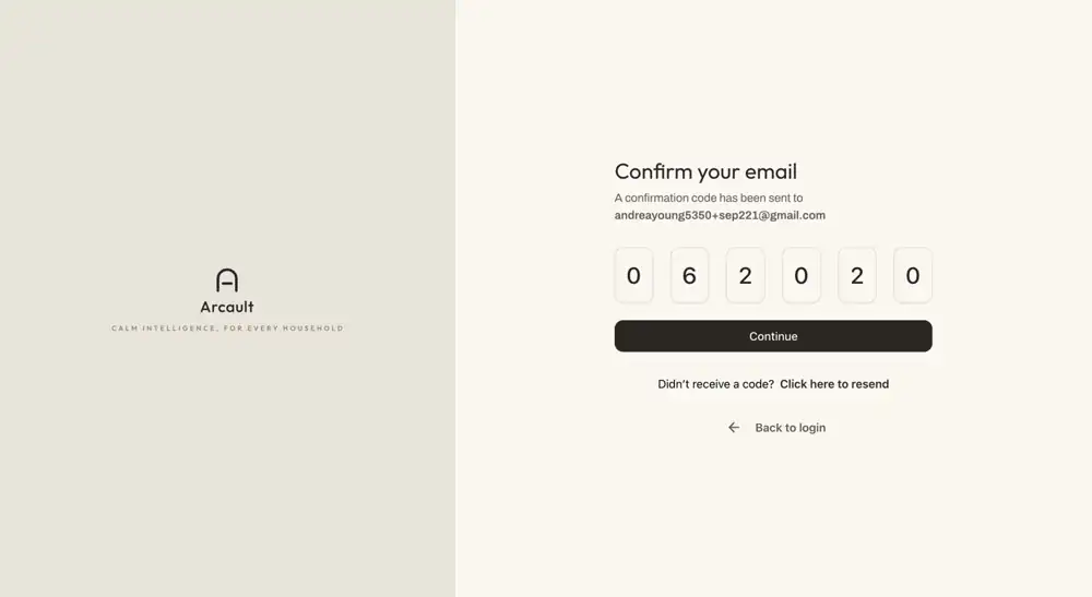
Then a calm two-step sign-up: make an account, confirm your email, you’re in.

Four Phases of the Home Screen
The home screen changed the most. Here’s how it got there.

Phase 1 · What I inherited
Busy, blue, and the AI was hiding in a sidebar.
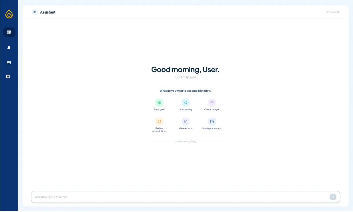
Phase 2 · Chat goes center stage
Clearer, but it felt like any other chatbot.
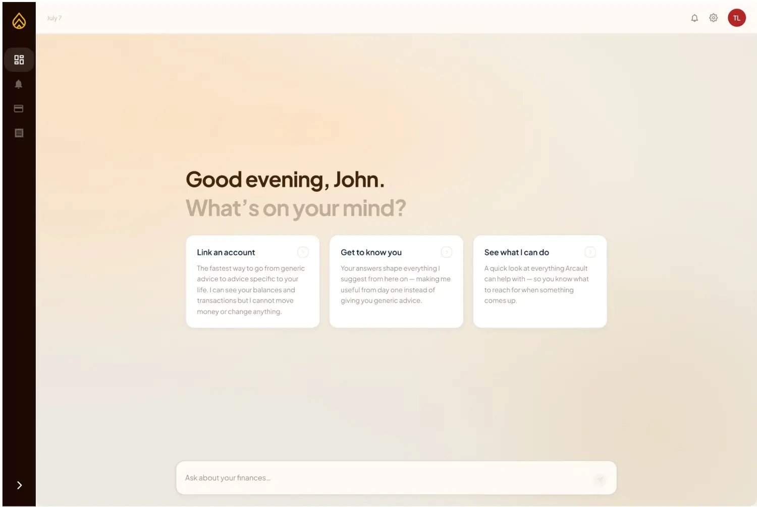
Phase 3 · The rebrand
Warm greige and softer words. Way more human.

Phase 4 · The advisor
Feels more approachable and warm while still modern.
Final Hi-Fis
What we shipped.

Advisor home

Analytics

Accounts and net worth
User Testing
I ran 10 first-use sessions in August, start to finish. Here’s what stuck.
Finding 01
6/10 wanted insights instead of a blank chat
Everyone wanted to see their numbers first, so now you land on a spending summary.


Finding 02
The chat felt like every other chatbot
Nobody knew what it could do. Adding more tables and chart capabilities helped.
Finding 03
Monitoring was a helpful feature
People found the most helpful feature was to set alerts on spending thresholds or large purchases.

Challenges & Takeaways
Successes
Learning Design Systems
Converted Storybook design libraries & moved them to Claude.
Research from nothing
Built user testing from scratch and turned every finding into a ticket.
Startup experience
Challenged myself to produce a high vol. of work in a short time.
Constraints
No official launch yet, so no usage metrics. I shipped 96 of 114 tickets and learned a ton from 10 testers.
Solo designer/engineer = speed vs. polish, constantly. Lesson: always re-test whatever’s next to the thing you fixed.
Biggest shift this summer: going from big corporate work to a close-knit startuo. I feel fulfilled by the amount of work I achieved this summer.


